


The third shot is a close-up of the protagonist turning back to look at the people chasing her. The composition is focused closely on her head, while the pursuers are placed in the distance and appear smaller in scale. This creates a strong visual impact and contrast, and also clearly shows who is chasing her.

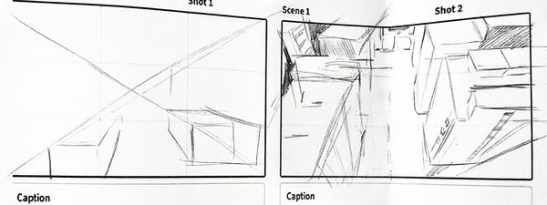

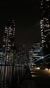
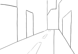
The fourth shot is a high-angle view. In this frame, I wanted to show the pursuers on the street splitting up and taking different routes to surround the protagonist. To achieve this, I referenced several images to help me draw the buildings and streets from a top-down perspective and better represent the spatial layout.


When illustrating the moment where the protagonist runs into a trash can, I used a fixed camera angle to present her movement. In this frame, the protagonist is shown running away from the camera, knocking over the trash can as she passes. I think this approach helps to clearly convey the action of the impact.


In the following shots, I wanted to depict the protagonist’s surprised reaction as she realizes she has reached a dead end. I first drew a medium shot of her running from the front, and then transitioned into a close-up to emphasise her facial expression.


Then, I wanted to convey the protagonist’s sense of helplessness when facing a dead end. I used a high-angle shot and depicted her looking upward, emphasising her panic and loss of control in that moment.

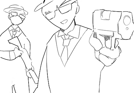
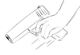
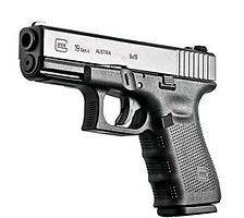
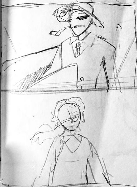
When introducing the antagonist, I wanted to emphasise their sense of dominance and intimidation, so I used a slightly low-angle perspective. When depicting the moment he draws his gun and points it at the protagonist, I added a close-up of him holding the weapon with a cold smirk. This was intended to highlight his cunning and sinister nature.


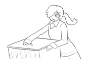
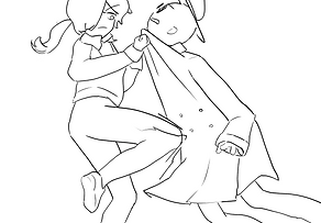
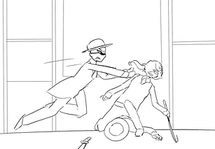
When drawing the fight sequence, I first created two shots from different angles showing the antagonist pointing a gun at the protagonist to threaten her. Then, I added a close-up of the protagonist placing her hand on the trash can lid, which serves as foreshadowing for the action where she uses it as a weapon, helping the audience understand what is about to happen.
After that, I drew a shot of the protagonist holding the lid, preparing to strike the antagonist. I then included a wide shot showing the moment she hits him on the head with the lid. I think presenting it this way creates a stronger sense of impact.


For the moment when the protagonist throws the trash can, I felt that the audience’s visual focus would naturally be on the object itself, so I included a close-up of the trash can.
Then, I showed the person being knocked down by it.
After that, I introduced the character who jumps down from above. I first used a wide shot to show him observing from a higher position, then cut back to the protagonist. I used an enlarged shadow to convey the motion of him dropping down.
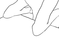
Next, the protagonist grabs his clothing and kicks him to the ground. Here, I also added a close-up of her action to emphasise the force and impact of the movement.


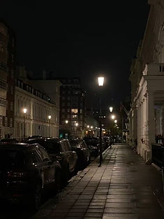


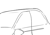


When drawing the shot of the car approaching, I referenced real-life images of SUVs and buildings. I included a close-up of the car door opening, followed by a shot of the antagonist stepping out of the vehicle. For the antagonist’s entrance, I used a slightly low-angle perspective to emphasise their sense of intimidation and dominance.


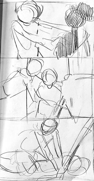
When working on these two shots, I created several rough sketches from different angles. I then selected the ones I felt were more expressive and better conveyed the story. For example, in the first case, I chose the version that more clearly shows the protagonist turning and running away. In the second, I selected a shot focusing on the antagonist’s pointing gesture, as it creates a stronger sense of pressure and impact, and better communicates his anger.


When drawing the warehouse, I referred to photographs to help depict it filled with stacked wooden crates. I also created a high-angle shot showing the protagonist positioned in the middle of the warehouse, which helps to establish both the setting and the character’s position within it.


When working on these fight scenes, I referred to several images for guidance. Many of these shots are framed at a closer distance, so there are quite a few medium shots, which helps to emphasise the intensity of the action. The moment where one character is pinned to the ground was particularly challenging in terms of perspective. To make the scene feel more dynamic and tense, I exaggerated and slightly distorted parts of the background.


Both of these storyboard frames were first designed on paper and then refined in Photoshop. The first one involves a more complex perspective, where I wanted to show the protagonist forcefully using a crowbar to knock the antagonist’s knife away.
The second is a wider shot. I chose to use a more distant framing here because the following shots contain more direct dialogue between the characters and will move into close-ups. Therefore, I felt that using a wider shot at this point creates a more balanced and cohesive visual progression.


These three storyboard frames depict the moment when the protagonist escapes from the warehouse. To better capture her movement from different angles, I referred to several photographs. I wanted to convey a strong sense of speed as she runs away.
In the first shot, I used a wide framing so that her full body is visible. The second shot moves in closer, showing only her upper body. In the third shot, I return to a wide view again, with her figure running further and further away into the distance.


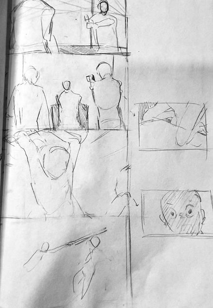
I compiled all of these sketches into a video to review how they work together. This allowed me to evaluate the overall effect, identify which storyboard frames were unnecessary, and determine where adjustments were needed. It also helped me form a clearer idea of how the images would come together in the final version.


To improve the quality and accuracy of my storyboard drawings, I also practised sketching figures in more exaggerated poses. After this practice, I felt more confident and comfortable when drawing my storyboard.


